
Brooklyn Rider Almanac
Visual Identity & Music Packaging
Brooklyn Rider & Mercury Classics
Design Direction
Design
Custom Typography & Image Making

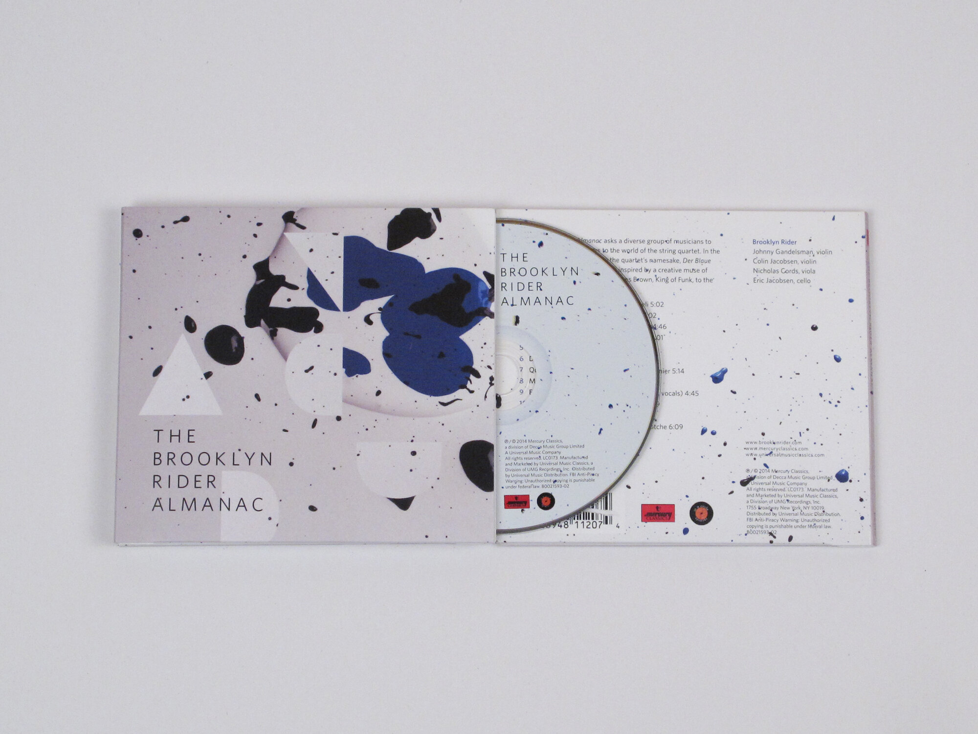
String quartet Brooklyn Rider asked various artists to contribute compositions to The Brooklyn Rider Almanac album, a project inspired by the Blue Rider (Der Blaue Reiter) Almanac. In the same spirit, EA Projects developed a visual composition to house the project. The visual identity is based on typographic experiments, resulting in letter-based forms, interacting with painted forms.
/ Design Detail / Written notation for music influenced the typographic direction for this project. The idea that single forms yield single sounds led to an exercise in taking apart letters (complex sounds) to find single lines. Each letter of the album title is represented by just one line. The paint-filled shapes are also the result of pulled-apart letter forms.